choice 2016: font is everything
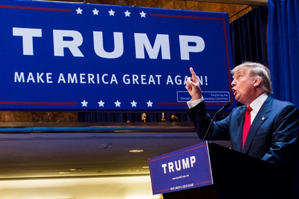
Today, as the T R U M P font smacked me around with its boorish appeal, it dawned on me that the font and logo choices of the people running for President in 2016 express deep truths about their candidacies.
Lemme break it down for you.
Christopher Gregory of Getty Images, how brave you are to attend a Trump event.
First we’ll consider the tremendously super-spaced all-caps T R U M P. This is textual manspreading. The blockish letter shapes are ever so slightly retro, in a Mad-Men-Season-One-I-can’t-handle-the-misogyny kind of way. It hearkens to the days of "bully boys." Hits you like a fist. All the extra space is so disturbing and yet sickeningly becomes (forgive me) almost pleasing? Because at least it’s unexpected?
Also: FIVE STARS. You know, like a GENERAL. A General who you better believe will do whatever the fuck Trump tells her to do. Oh, that's illegal? Believe him: Trump would never say that. Never. He might have heard it somewhere, that he should tell the generals what to do. Someone might have said it. Probably said it. He doesn't know, okay? It's been said, though. Believe him.
It's hard, running for president. Tremendously hard. Unbelievably hard, believe him.
Before we can move on, we must turn our attention to this, the most chilling sign in the history of political signs:
Those italics are beyond creepy. If one were to read them aloud, one would have to do so in a gritty, clicky Shyamalanian whisper. Or hissing like a thousand poisonous snakes.
I’m sorry, I have to move on.
Yeah, that's a black background all right. Ted goes his own way. So yes, this is a black background for a black sheep in these black days with a black president.
Onto the letters: well, OF COURSE he’s going Serif. It’s rigid as hell. And OF COURSE he’ll capitalize his proper nouns, just like he learned in first grade and has done ever since. Also I am sure that’s how they did it in the Constitution.
What is that logo, though? Is it the flame of conviction that burns every bridge Ted approaches? Is it a teardrop shed upon considering innocent pre-born children in the wombs of Godless abortion-seeking women?
Probably both.
Let's give credit where credit is due, though. I do think Ted scored a big win with that TRUSTED sign:
thank you for this 100,000 word picture, AP photographer Paul Sancya.
We have to give it to him: that is straight-up clever. I mean, not enough to make him in any way an acceptable leader of anything, ever.
Look at that red-hot TED. Crimson as a firebrand. Bloodied from battle. He's the only one who made it out alive, but that was his plan all along.
Seriously, though: that sign is really worth whatever anti-women’s-rights money he spent getting someone to come up with it.
Next up:
Adorable. Just adorable. Look at that little tiny USA dotting the “i”! So cute!!
Wait, maybe it’s not just adorable. Maybe it’s JUST. RIGHT. Bold but lower-case. Roundy but blockish. Red and blue, but not stupid Democrat blue. Dark, navy, all-grown-up, my-first-expensive-suit blue.
Let's attend to the tag line. An all-caps but very slightly rendered A NEW AMERICAN CENTURY. marco: big and bold and on top, but also lower-case and roundy. NEW AMERICAN CENTURY: all-caps, but so faint and uncentered.
Where am I supposed to look?
The letters of the NEW AMERICAN CENTURY are a little squished. Actually, that font captures exactly the hurried speed of the MarcoBot diatribes and promises. And it also evokes the vague, unsettled tone of Marco’s voice when he talks about anything that has ever actually happened, like his Gang of Eight work.
So, I guess we are invited to see what we want to see. Who is Marco? Well, who else is in the room, and who do they want him to be?
One more thing: what is that terrible shadow over on the left from which marcorubio emerges? So portentous! A blackish shadow which we must cast off! Right.
Okay, because I feel like I have to:
YAWN. Now I know how journalists forced to cover Kasich feel. Are these keystrokes even worth it? Does what I’m about to say about this guy matter in any way?
Here goes: this is a non-logo. Possibly the campaign staff just went to Kinko’s and said, “Um, we need some signs? That say Kasich in real big letters? By tomorrow?” and the Kinko’s person politely threw something together for them.
The K with the wavy lines (bacon strips?) stretching out of it is so awkward, so strange, so . . . WHAT IS IT EVEN DOING HERE. Somebody please spend some time making it worthwhile or compelling in any way. Or better yet: just take it away.
Switching sides:
So, I am not a person who is Feeling the Bern, but I will admire this logo. It is very friendly. Big, kinda squishy, but totally substantial letters. A playful, let’s-not-take-this-too-seriously star dotting the “i”. See that little swirl in the “r”? It’s just a teensy bit retro, in a comfy-threadbare-shirt-from-the-70s-that-you-stole-from-your-dad kind of way.
Bernie uses his first name only, of course. And no icon - that would be too polished, too commercial. This is not a brand, it’s a movement! Just look at all that movement in the currents of red, white & blue just below his name. I know there's only one white man's name on this sign, but trust me, it's a movement. People are moving twenty-seven dollars - I mean, one vote! - at a time.
I want to say the whole thing looks timeless, but something about it makes me think about Mr. Roper and Jack Tripper. In those two, as well as in the blocky letter-edges and swirly flourishes here, there's an irresistible combination of hard-lining and cheer.
It evokes for me Mr. Roper's adorable crankiness. And Jack's improbability, as a makebelieve challenge to the status quo at the same time he is the embodiment of the status quo. Hmm weird. Maybe it's just the swirl in the "r."
Last but not least, my girl Hillary.
this is such a beautiful compilation by the Quartz people. Out of one, many, y'all.
A new friend pointed out to me that Hillary’s logo has already been declared perfect. I have the sense that this “H-arrow” has been ready to be launched for a long, long time. I love that it is as simple and stylish and versatile as good black pants.
And how about her signage font?
Sans serif but clear. Strong but curvy. Not too anything: these are just-right, Goldilocks letters. Apparently, this font was custom-made, just for her. It is a version of Sharp Sans called . . .
Unity.
Of course it is. Head to toe, this is some carefully calculated, expertly rendered stylistic representation.
And we would expect no less.


